


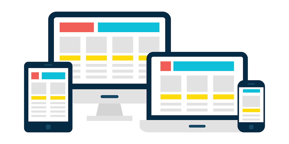
Roughly half of web traffic comes from mobile devices. You certainly don’t want to ignore this audience! Whether it’s reading content, adding items to a shopping cart or viewing product images, your mobile visitors should receive a seamless and responsive user experience – just like your desktop users!
Magna Technology designs and builds custom websites for our clients. We always choose responsive designs that ensure optimal user experiences. The best part is that these websites are affordable and streamlined. They’re easy to update and maintain, allowing you to keep up with the latest trends instead of gradually growing out of date.
To learn more about building a mobile responsive website for your business, contact Magna Technology. In the meantime, let’s cover some of the ways you can build a mobile responsive website for your customers to enjoy.
Start with Google’s Mobile-Friendly Testing Tool
Google’s mobile-friendly test tool lets you check to see how mobile friendly your web pages are. The tool is easy to use. Simply enter in your website’s URL and you’ll get an immediate result. If your site isn’t mobile-friendly, Google will tell you what areas you need to fix.
Choose a Platform that Supports Mobile Friendliness
While there are many great website builders out there, we often default to WordPress. WordPress has hundreds of themes that let you change the look and feel of your website. Plus, there are many templates available for various industries, such as real estate, freelance, software and photography. This makes it easy to get a beautiful, responsive website ready for launching.
Better yet, every single WordPress theme is responsive. This means that no matter what device your audience is using – desktop, tablet, smartphone – they’re going to get the same fluid experience. Your customers will be happier, and you’ll see better results in terms of traffic and rankings.
Test All Custom Elements
While there are plenty of themes ready to go, they don’t always fulfill what business owners need. To add the right features to your website, you might look into customization options such as plugins and CSS. While these elements can certainly provide you with the features you’re looking for, they can also cause problems.
If you want to add custom elements to your site, we recommend testing them to make sure they do not affect mobile responsiveness. Unfortunately, some will. We also recommend not using pop-ups – mobile users do not like these because they take up precious screen space. Just some things to think about if you do choose to add custom elements to your site.
Compress Your Files
A great way to boost mobile responsiveness is by compressing your files. Most mobile devices rely on lower bandwidth than desktops so you’ll want to keep your data and power usage to a minimum. Otherwise, your website may be slow and inconsistent for mobile users.
Again, WordPress takes care of most of this for you. Most themes automatically compress CSS, HTML and JavaScript files. No third-party plugins necessary. We also do not recommend high-resolution images or animations, as these are known for slowing down performance.
Simplify Your Navigation
No one likes complicated navigation, but this is especially bothersome for mobile users. It’s not as easy to point and click to move around a website, so they expect a clean and simple navigation with as few clicks as possible. Remember, mobile users have a limited screen size so they often can’t see all of their options at once.
We recommend displaying your main categories and having drop-down menus with subcategories. This will help mobile users find what they’re looking for when they visit your site. Also be sure to have clear calls to action, tappable links and colorful buttons.
Create Mobile-Friendly Copy
In order to create the best content possible, it’s helpful to know who you are writing to. There are three types of web visitors:
- Skimmers are people who scan a web page for key information such as your store hours or restaurant menu. They come for one thing and expect to find it quickly.
- Swimmers read every single word when they’re viewing your website. They’re looking for detailed information and are expecting to be educated on a particular topic.
- Hybrids are a mix between the two. If your website is engaging, hybrids are more likely to stick around and read more of your content.
Make sure you are creating content for all of your visitors. Some will want a few key details to help them make a decision, while others will want more detailed information.
Build Your Mobile Responsive Website Today
Magna Technology is committed to designing and building fast, optimized websites for our clients. Mobile responsiveness and friendliness are always at the top of our list, as we know how important it is to deliver an optimal user experience across all devices. By choosing us, you’ll feel good knowing that your mobile users are getting the same experience as your desktop users.
To speak with a member from our team, contact Magna Technology today. We can assist you in building a brand new website or updating your existing website. We have solutions for all needs and budgets!