


It’s no secret that you should split test various elements on your website. This allows you to see what works for your audience and what doesn’t. By applying the best practices to your website, you can convert more users and make more money from the web traffic you’re getting.
Usually, articles are broad on the elements they say you should be A/B testing. Today, we are going to cover seven things that you should absolutely test on your web pages. These elements are game-changing, so by focusing on them, you can quickly increase conversions and sales.
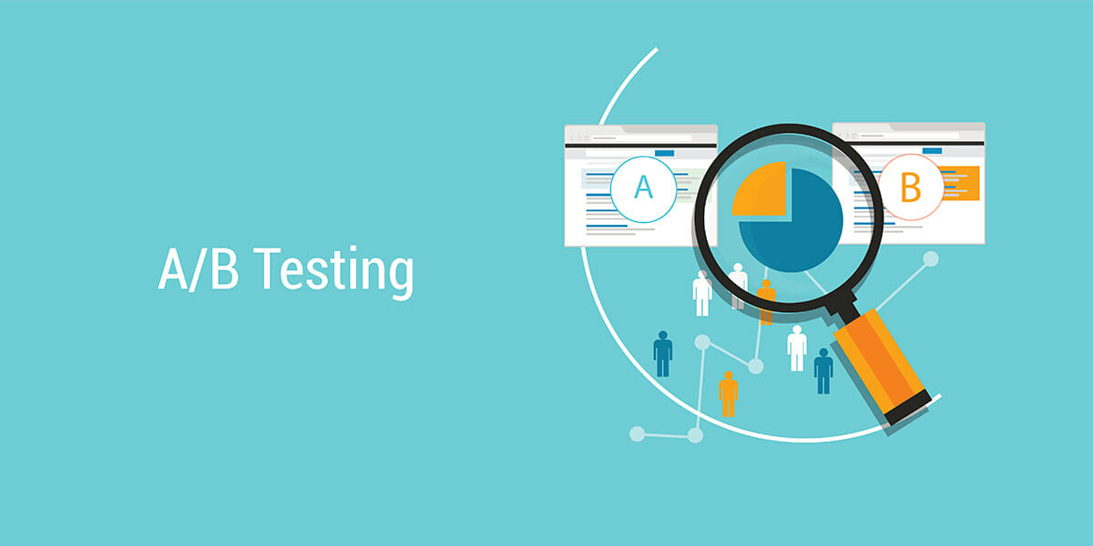
Let’s dig in.
Type of offer
Consumers don’t want to get roped into a product or service they may not like. Reassure your customers that they can try out your product or service with no strings attached. You can offer them a free trial, money-back guarantee or demo to help them feel more comfortable with the sale. Test your offers to see which ones are most attractive to your customers.
CTA color
The color of your CTA buttons matters. According to this HubSpot article, there’s a 21% increase in conversions when using a green button instead of a red one. That said, HubSpot found that it wasn’t the color per se, but rather its uniqueness of the button color compared to the rest of the page. So, split test various colors to see which ones result in more clicks.
Pricing
Pricing an item higher and then reducing it for a sale or promotion convinces people that they’re getting a good deal. So, try different pricing to see if this makes your products look higher in quality and more valuable. For example, a product that you sell for $29.99 can be increased to $39.99 with a discount of 25%. Both come out to the same price but are perceived differently by shoppers.
Sales copy
Your sales copy can be short or long depending on what you’re selling. For products that are new or hard to understand, expect to create more content. On the flip side, familiar products should only need short sales copy. Of course, A/B test the different lengths to see which one performs best.
CTA button copy
When people click on a CTA, they usually want to know what’s going to happen. Are they going to watch a video? Answer questions? Fill out a form?
Be as specific as possible on your button copy. For instance, instead of a generic button that says, “Click here to continue,” you can create one that says, “Click here to get your 10-day trial.” This is more specific and puts customers at ease before they click.
Almost everything on your site can be split tested, but you probably don’t have time for that all at once. For now, start with these key elements that have a direct impact on your conversion rates. If you’re still having trouble with getting people to convert, contact Magna Technology. We build conversion-focused websites for businesses in all industries.