


For years, mobile device use has been on the rise. Smartphones have become such a regular part of our everyday lives, people do just about everything on them. As we approach the holiday season, it’s especially important that your site is mobile friendly. More people are doing their holiday browsing and shopping from their mobile devices and you want to be accommodating to them.
Below are eight ways to make your website mobile friendly.
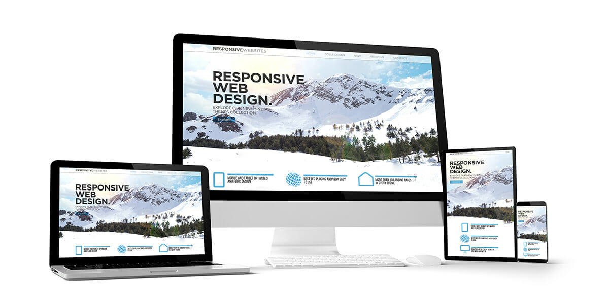
1. Choose a responsive design.
A responsive website adapts to the screen it’s being viewed on. This is the best option for making your website mobile friendly because your mobile visitors can access the same information no matter what device they are on. A responsive design is also good for SEO.
2. Make it easy to find information.
People expect to find the information they need in as few clicks as possible. Place important information in obvious places, and address common questions on your FAQ page. Mobile users shouldn’t have to look hard to find the information they need.
3. Swap Flash for a newer technology.
Flash is no longer a good option for playing multimedia on websites. It can slow down your page load times, causing visitors to bounce off your site. In fact, Adobe announced it will retire its technology in 2020. Flash is now being replaced with technology like HTML5 and CSS3.
4. Turn off autocorrect.
If you want visitors to fill out forms, make the process as easy as possible. The way to do this is by asking only for the information you need and turning off autocorrect. If this feature is left on, the user’s phone will try changing names and streets to something more familiar.
5. Make your buttons large.
Another thing to pay attention to is the size of your buttons. It’s frustrating to try to click small buttons on a smartphone, especially if they’re close together. Please your visitors by choosing large, responsive buttons. Test them out yourself to make sure they work.
6. Use large font sizes.
The font you select also matters. Reading on a small screen is much harder when the font is tiny. Use a font that’s at least 14px and test it out to see if it should be bigger. Also, stick to standard fonts that are quick to load and easy to decipher.
7. Compress your images.
To ensure your website is as fast as it can be, you’ll want to compress anything that takes up space and slows down loading times. The good news is that compressing images and CSS makes your site faster without affecting quality.
8. Perform regular mobile testing.
The best way to make sure your website’s mobile experience is the best it can be is by testing it out on your mobile device. Spend time browsing your website and testing out forms, buttons, load times and more. Address any problems you find.
Mobile devices continually change, so it’s important to test your website on a regular basis. Keep making adjustments to ensure your site functions optimally. Continue to do this while putting your users first and you should have no problem maintaining a mobile friendly website.