


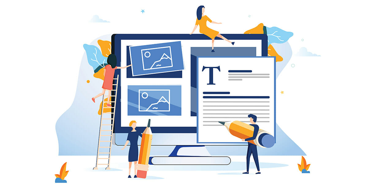
When you visit a website, some elements probably catch your eye more than others. It could be a logo, a call to action button or an image. These elements don’t just catch your eye by coincidence – they are intended to grab your attention. This is called “visual hierarchy.” By using design fundamentals, you can draw users to certain elements on your site.
Let’s learn more about visual hierarchy in web design and how it can be used to guide visitors through your website.
Why Visual Hierarchy is Important
Visual hierarchy tells a person what’s important on a page. When done right, the eyes move to the right places, keeping them in the funnel until they complete the desired action. Without this organization, the visitor wouldn’t know what content is most important.
Visual hierarchy should be used on your own website to lead your audience through your message. Fortunately, there are simple ways to do this, and you don’t have to be a master in web design to be successful. What you will need to learn is how design fundamentals interact with each other. We’ll cover this in the next section.
Tips for Implementing Visual Hierarchy
Scale
Larger objects are more noticeable than smaller ones. The human brain also associates big font with importance. Use size to lead visitors to the most important content on your page. The rest of the content can be printed in a smaller font.
Color
Color, too, tells people that something is important and should be given more attention. Use bold, contrasting colors to highlight key information that you want your visitors to take note of. Often, color contrasting is used on key words and phrases, links and calls to action.
White Space
White space gives breathing room in between elements. Without it, a web page can become cluttered, leaving visitors overwhelmed. Use white space appropriately, such as in between paragraphs and around images. This will give the right amount of space around key elements, allowing users to focus their attention on each section.
Contrast
Contrasting colors or fonts is a simple, effective way to grab someone’s attention. This change signals that something is different, and therefore, should be paid attention to. Experiment with contrasting colors (light vs. dark) and contrasting fonts (italic vs. bold) to communicate your message.
Alignment
Alignment is commonly used to guide visitors through a web page. You may notice that many of the websites you visit have a hero image and supporting text in the center, while others place text to the left. Play around with various alignments to see what looks best on your site and what your visitors are most drawn to.
Conclusion
When working with visual hierarchy, it’s best to focus on specific areas of your website. Pay attention to the content that deserve the most attention, such as CTAs and links. These elements will stand out from the rest of your content and guide users through the funnel. For suggestions on how to achieve proper visual hierarchy on your site, contact the web design experts at Magna Technology.